When you think about airlines, what comes to mind? The sleek aircraft, the friendly cabin crew, or perhaps the comforting hum of the engines? But have you ever wondered about the font choices airlines make and how they impact their branding? Fonts may seem like a minor detail, but they play a crucial role in shaping an airline’s identity and conveying its message effectively. So, what font do airlines use?
Join us as we delve into the world of airline branding and explore the typography choices in aviation. From Swiss Airlines’ iconic Univers 65 Bold to Lufthansa’s timeless Helvetica, discover how typography shapes the visual identity of leading airlines. We’ll also uncover the custom typefaces used by British Airways, Scandinavian Airlines, and KLM, showcasing the thought and design that goes into crafting a unique brand image.
But it doesn’t stop there. We’ll also explore the significance of font choices in other aspects of aviation, such as airport wayfinding signs. Find out why airlines rely on fonts like Frutiger, Helvetica, and Clearview to guide passengers seamlessly through airports.
Curious to learn more about the world of airline typography? Stay tuned as we reveal the answers and unlock the secrets behind airline font choices.
Swiss Airlines
Swiss Airlines, a renowned airline based in Switzerland, carefully selects its fonts to represent its brand image effectively. One of the key fonts used by Swiss Airlines is the Univers 65 Bold, designed by Swiss typeface designer Adrian Frutiger. This font adds a touch of sophistication and professionalism to the airline’s visual identity.
When it comes to creating a logo that captures the essence of Swiss Airlines, the airline sought the expertise of the design studio Nose. Known for its specialization in transportation design, Nose collaborated with Swiss Airlines to develop a visually appealing and unique logo that accurately reflects the airline’s identity.
In addition to the logo, the design studio Nose also played a significant role in creating design guidelines for Swiss Airlines’ aircraft interior and corporate interior design. These guidelines ensure consistency across various touchpoints, from the cabin experience to the branding elements integrated within the airline’s physical spaces.
Swiss Airlines understands the importance of meticulous font selection and design collaboration to create a cohesive and visually appealing brand presence. By utilizing the Univers 65 Bold font and partnering with the design studio Nose, Swiss Airlines establishes a strong and memorable visual identity that resonates with its passengers.
Lufthansa

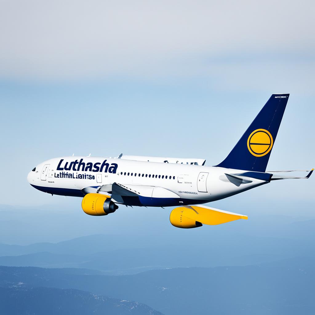
Lufthansa, one of the leading airlines in the world, has a distinct font choice that embodies its brand identity. The airline uses the iconic Helvetica font, which was originally developed in 1957 by Swiss typeface designers Max Miedinger and Eduard Hoffmann. Helvetica has become renowned for its clean and modern aesthetic, making it a popular choice across various industries, including graphic design and typography.
Lufthansa’s decision to use Helvetica aligns with its commitment to portraying a sleek and professional image. The font’s simplicity and versatility allow Lufthansa to effectively communicate its brand message to passengers, whether it’s through signage, advertisements, or digital platforms. Helvetica’s timeless appeal and legibility ensure that Lufthansa’s visual identity remains strong and recognizable.
Fun fact: Helvetica has made such an impact on the design world that a documentary film titled “Helvetica” was released in 2007, exploring the font’s influence and widespread usage.
Helvetica Font Example:
British Airways

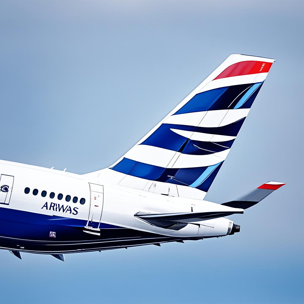
British Airways, one of the leading airlines in the world, stands out with its distinctive font called Mylius Sans Regular. This custom typeface was specifically designed for British Airways’ branding and is not used by any other airline or company. Created by renowned British font designers Rodney Mylius and Robin Nicholas, Mylius Sans Regular reflects the airline’s commitment to upholding its unique identity and visual identity.
The Mylius Sans Regular typeface exudes elegance, professionalism, and modernity, making it a perfect fit for British Airways’ branding elements, including its logo, marketing materials, and website. The clean and legible design ensures clear communication and enhances the airline’s overall brand image.
With Mylius Sans Regular, British Airways successfully differentiates itself from other airlines and conveys a sense of sophistication and reliability to its passengers. This font choice reinforces the airline’s commitment to quality and exceptional customer experience.
| Description | |
|---|---|
| Font Name | Mylius Sans Regular |
| Created By | Rodney Mylius and Robin Nicholas |
| Usage | British Airways’ branding elements, including logo, marketing materials, and website. |
Scandinavian Airlines

When it comes to Scandinavian Airlines (SAS), their commitment to Scandinavian design is evident in every aspect of their brand. They wanted to establish a clear distinction between themselves and their competitors, and the choice of font played a crucial role in achieving that goal.
The typeface used by Scandinavian Airlines is appropriately named “Scandinavian” and was created by talented font designer Robin Nicholas. In collaboration with the Stockholm Design Lab, Nicholas developed a font that embodied the essence of Scandinavian design, known for its simplicity, elegance, and functionality.
Scandinavian Airlines unveiled its new corporate identity, including the Scandinavian font, in 1998. Since then, the font has become a recognizable element of SAS’s branding and marketing materials, reinforcing their commitment to Scandinavian values and culture.
This carefully crafted typeface perfectly complements SAS’s overall brand image, conveying a sense of sleekness and modernity that aligns with the airline’s reputation for quality service and attention to detail.
| Key Features of Scandinavian Airlines Font |
|---|
| 1. Clean and minimalist design |
| 2. Easy readability |
| 3. Reflects Scandinavian design principles |
| 4. Conveys sleekness and modernity |
KLM
KLM, the flagship carrier of the Netherlands, pays meticulous attention to its visual identity, incorporating the use of captivating typography to reinforce its brand image. The airline has adopted the Noa Bold font, meticulously crafted by Danish designer Nina Lee Storm in 2004. The Noa Bold font is strategically employed in various elements of KLM’s corporate identity, including its logo, magazine, posters, and other promotional materials. With its bold and modern aesthetic, the Noa Bold font perfectly encapsulates KLM’s commitment to innovation and contemporary design.
The Noa Bold font was originally created to be used in digital mediums, such as television and computers. However, KLM recognized its potential to enhance their brand’s visual identity and adaptability across different platforms, making it integral to their overall communication strategy. This font lends a sense of authority, boldness, and reliability to KLM’s branding, establishing a strong presence in the competitive airline industry.
Airport Wayfinding Signs
Airport wayfinding signs are an essential part of navigating through airports efficiently and effectively. These signs are strategically placed throughout the terminal to guide passengers to their desired destinations, such as gates, baggage claim, customs, and transportation options. The design of these signs is crucial for ensuring passengers can easily comprehend the information they convey.
When it comes to typography in airports, simplicity and readability are key factors. Sans-serif fonts, known for their clean and legible appearance, are commonly used on airport wayfinding signs. Among the popular sans-serif fonts used, three stand out: Frutiger, Helvetica, and Clearview.
Frutiger: Created by Swiss type designer Adrian Frutiger, the Frutiger font is renowned for its readability at various sizes. Frutiger was designed with the intention of enhancing legibility in transportation signage. In fact, Frutiger is the typeface behind several airport sign systems, including the Roissy typeface used at Paris Charles de Gaulle Airport.
Helvetica: Another widely used font in airports is Helvetica. Originally developed in 1957 by Swiss typeface designers Max Miedinger and Eduard Hoffmann, Helvetica has become a staple in graphic design and branding. Its simplicity and clean lines make it an ideal choice for legible signage, including airport wayfinding signs.
Clearview: Developed specifically for highway signs in the United States, Clearview is a typeface designed to enhance legibility from afar and at high speeds. Though not as prevalent as Frutiger and Helvetica, Clearview has been adopted by some airports for its improved readability and visibility.
Studies have consistently shown that simpler text is easier to read and follow, especially in potentially stressful or time-sensitive situations like navigating through airports. Clear and legible typography on airport wayfinding signs can help reduce confusion and enhance the overall passenger experience.
| Font | Designer | Year |
|---|---|---|
| Frutiger | Adrian Frutiger | 1975 |
| Helvetica | Max Miedinger, Eduard Hoffmann | 1957 |
| Clearview | Donald Meeker, Chris O’Hara, James Montalbano | 1994 |
Custom Fonts in the Airline Industry
When it comes to branding, airlines understand the importance of standing out from the competition. That’s why many of them choose to use custom fonts and logos, allowing them to create a unique and recognizable identity.
Major airlines often invest in custom-designed typefaces or even hand-lettered logos, ensuring that their brand is visually distinct. These custom fonts become integral elements of the airline’s overall image, appearing on everything from in-flight magazines to advertisements.
While custom fonts are popular among larger airlines, smaller carriers may opt for commercially available fonts that still convey their desired aesthetic. Balancing cost and uniqueness, these commercial fonts provide a professional appearance while maintaining brand consistency.
Ultimately, the use of custom fonts in the airline industry plays a crucial role in shaping an airline’s identity. By carefully selecting and designing these fonts, airlines can establish a strong visual presence and leave a lasting impression on passengers.


